6 Ways to Improve Your Pricing Pages
Each day, buyers make over 428 essential business purchases. As these people evaluate companies, pricing pages create an opportunity to optimize them to get them to buy.
Yet, for many sites, there isn’t enough attention paid to this valuable piece of real estate.
Visitors must have clear signals guiding them toward meaningful offers on these pricing pages. Understanding how to structure elements on your page will make it easier for customers to choose between multiple pricing tiers.
And using the tips below, you can use design as a tool to improve your pricing pages and give people a simple path to purchase leading to considerable advantages, including more market share and customer loyalty.
1. Use the Z-pattern to guide customers through pricing pages
When users encounter pages on your site with minimal text, they read from the top left to the top right. This is especially the case with readers of western languages.
It’s known as the “Z-pattern” and is one of the most common page layouts online.
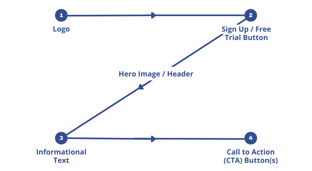
When a person lands on a pricing page, the z-pattern works like this:
- Readers start by looking at the top left, where the logo is usually placed.
- Their eyes will move along the top right towards top-level navigation and CTAs.
- Then they’ll move diagonally toward the bottom left to read the headline.
- Finally, the reader will evaluate each pricing plan’s features and cost from left to right.
Let’s see what happens when you overlay this on a pricing page.
Quickbooks
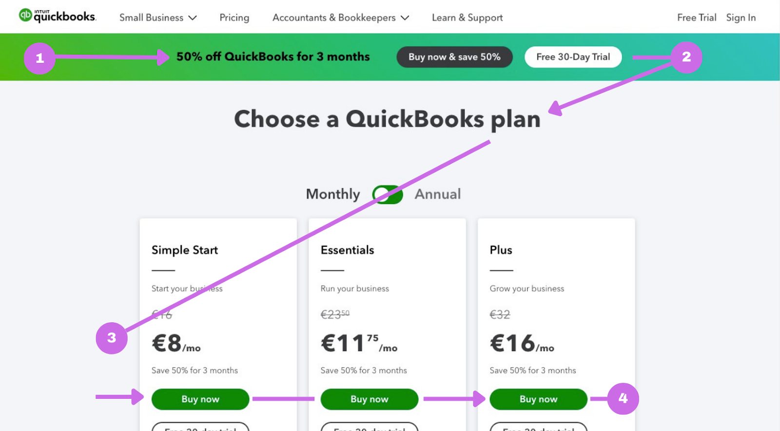
You can see how the eye is guided from the logo to the Free Trial button. Then the visitor sees the headline before skimming on to the description text for each plan and CTA buttons.
Each element on your website is working towards attracting the viewer’s eye. Colors, shapes, and patterns work together to nudge a prospective customer and tell them where to look next.
This is known as ‘visual weighting.’ It’s the force of the elements within an image that compete for attention. In this case, these are the graphics used on your pricing table. When optimizing these pages, the z-pattern combined with visual weighting introduces and leads potential customers toward the offer you want them to buy.
2. Create a hierarchy in your pricing tiers
Even though printed newspapers are sadly becoming a thing of the past, we can learn plenty from them to illustrate how visual hierarchy works online. Newspapers use giant fonts in the headline to briefly explain what the smaller text beneath it will talk about. And when you look at this, your eye goes straight to it.
The same happens online.
When done right, a pricing tier should guide, not misdirect. Instead, a pricing page design should deliver information in a logical, usable format and help readers quickly find what they need to decide.
PandaDoc

Looking at this pricing page, the header is so prominent that the eye moves from the headline to the copy beneath it before moving on to each product plan. There’s a natural flow and hierarchy taking people through the page.
The key information is designed and presented to give the highest priority to their header and defines what each pricing tier offers.
3. Reduce visual complexity to communicate your offers
Too many visual distractions distract from the elements you want visitors to look at. Those momentary distractions interrupt readers’ flow as they move down the page. Once they reach the pricing table, potential buyers need to easily discern between colors and shapes so they can quickly identify and categorize them.
But when you don’t do this for people, they’ll waste time searching, leading to frustration and a low conversion rate.
Let’s look at some examples of pricing page designs that make it harder for people to find what they need.
Matrak
This pricing page makes visitors work incredibly hard to decipher each pricing tier for this SaaS product. The landing page places all the pricing beneath the fold, so visitors have to scroll before it appears.
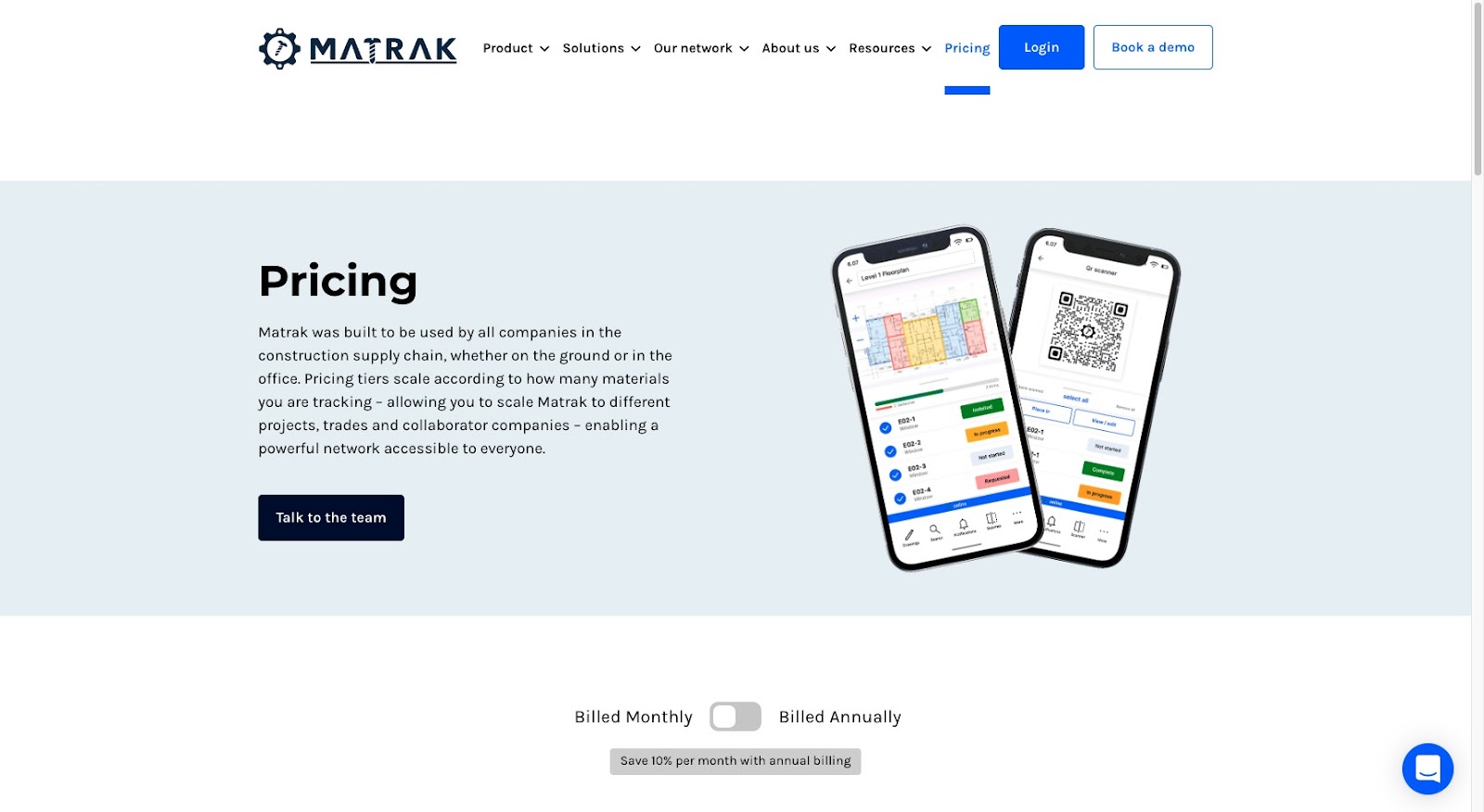
After scrolling down, they can see all the software’s pricing options.
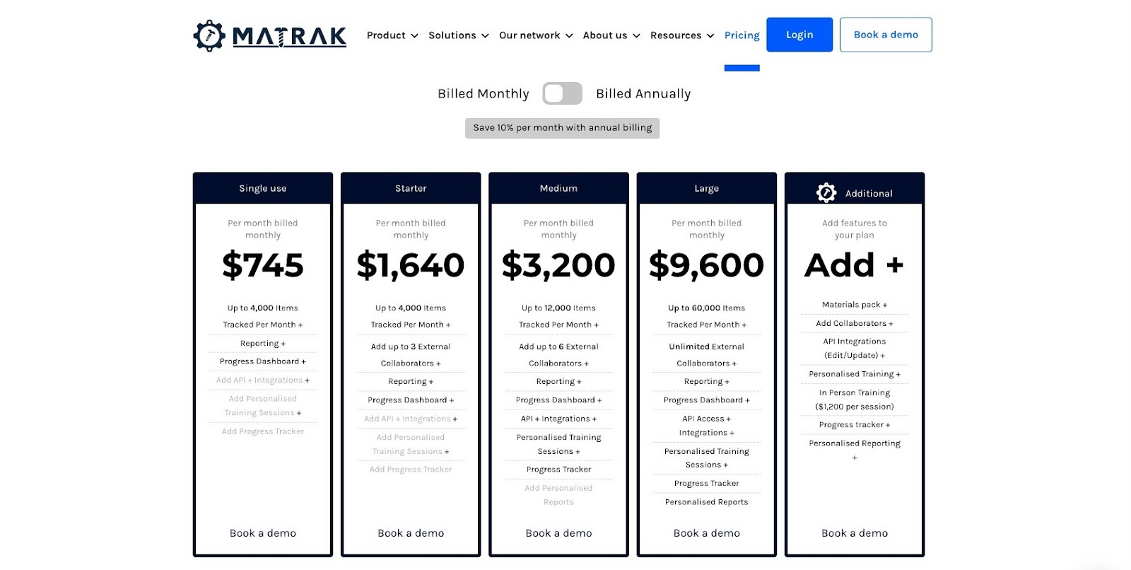
But there are a few issues:
- There is no difference between each tier’s colors, shapes, and sizes.
- The “Book a demo” is unrecognizable as a CTA and blends into the description text.
- Grayed-out text signals add-on services but isn’t explicit when reading each plan.
- The additional features on the right don’t clearly or immediately show the benefits of this service.
- Tier names are tiny and difficult to read, impacting legibility.
This page throws enough hurdles in the buyer’s way that they would struggle to make it happen even if they were ready to sign up for a demo. Even though there’s transparent pricing, there’s no visual weighting to move the eye towards a specific plan or separate any of these high-priced services.
Microsoft
Even huge companies could do a better job of guiding people toward the plan they want them to buy. Microsoft 365’s pricing page design has more color to highlight their plans and CTA buttons.
However, each one is almost the same. The page forces potential customers to spend valuable time reading each plan without clearly differentiating between them.

These examples show what it looks like when you don’t use enough contrast to separate the individual plans on a pricing page.
4. Introduce graphics and icons to create visual comparisons
Let’s do an exercise. Someone puts two blue squares on the screen. You instinctively want to sort them.
And you want to do it because the human brain craves structure.
The same thing happens with the use of graphics on a page. Using icons gives people an image they can immediately classify.
Unbounce

Unbounce’s tiered pricing use photo-realistic imagery to demonstrate what people can expect once they sign up. One difference between Unbounce’s pricing page and its competitors is that they are fearless in using oversized graphics to grab someone’s attention.
Notion
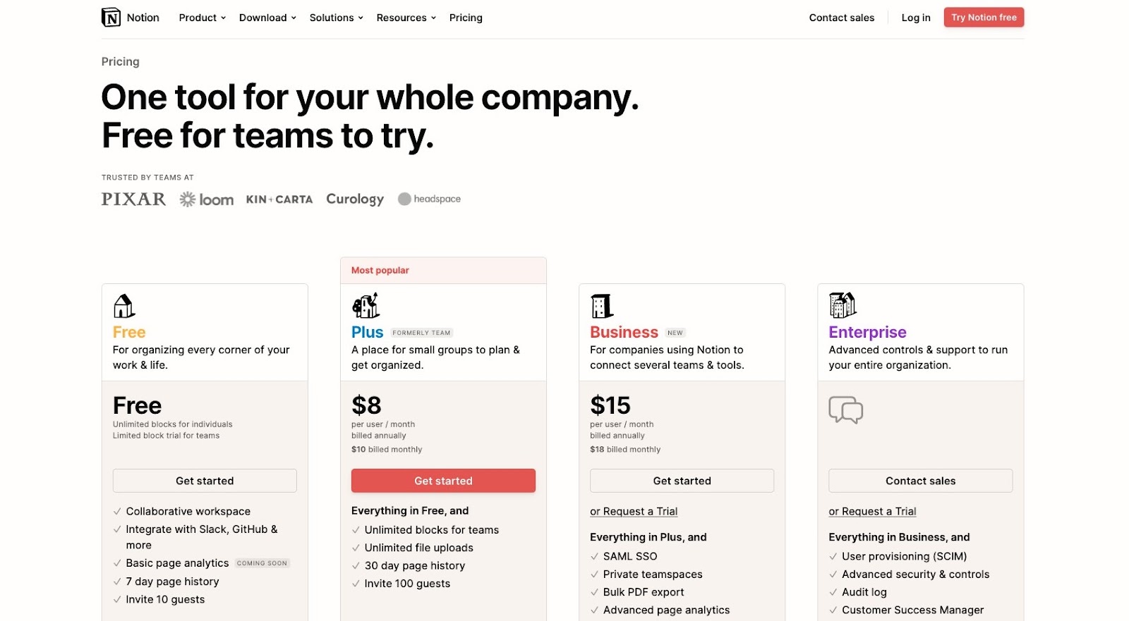
Notion uses subtle illustrations and colors to separate each pricing option. The simplicity of these icons still enables each product offering to stand out. As the icons progress, they become further defined so buyers can see how these graphics represent the stage of their buyer’s company—and build a more substantial business.
Venngage
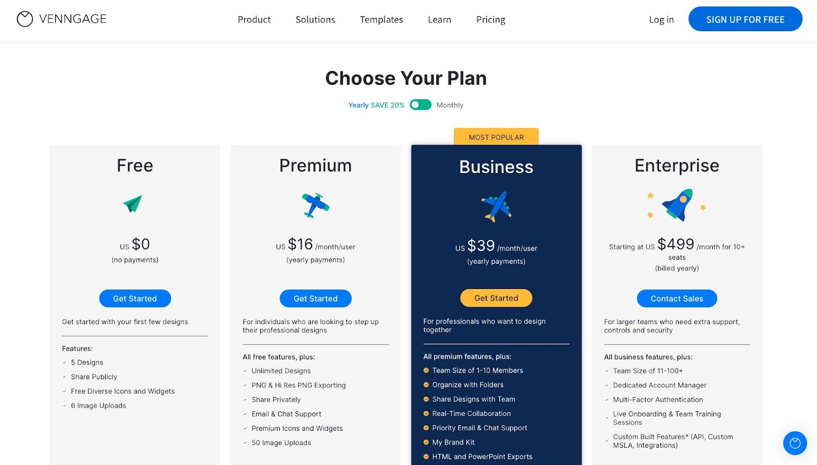
Venngage also uses illustrations as part of their feature comparison for different plans. Each icon varies just enough in size and shape to show a progression in both cost and features.
But more importantly, Venngage’s icons have a visual theme: innovation.
Each one shifts from a simple image into the modern-day airplane before showing the pinnacle of human innovation: space travel. This pricing page tells a visual story that buyers can immediately associate with progress.
5. Embrace color to help buyers focus on one offer
There are some characteristics people will notice before others. For instance, most people will perceive color before shape. And when making a purchase, some buyers evaluate products based solely on color.
The pages below use the principles of color psychology to give people distinctive signals about which offer they should consider first.
Headspace

In a small study by UserTesting, they revealed in their sample that participants found brighter sites to be more memorable than darker ones.
Headspace turns up the color on this pricing page by calling out their Annual plan with a bright gold and blue combo. The page has more than enough white space to ensure that the eye instantly goes to the annual plan versus monthly.
1Password

1Password does something a bit different with its different pricing plans. They don’t show the software’s cost from descending to ascending.
Instead, they place their more expensive plan for the Teams Starter Pack first on the page. Each tier on 1Password’s pricing page is individualized, so one contains a brand color.
However, each tier also uses accent colors to highlight other value-based messaging like “Best value for up to 10 users” and the bonuses you get with the cheaper Business plan.
These color combinations are an example of how you can control visual weight on the page by using contrast to communicate additional information.
Harvest
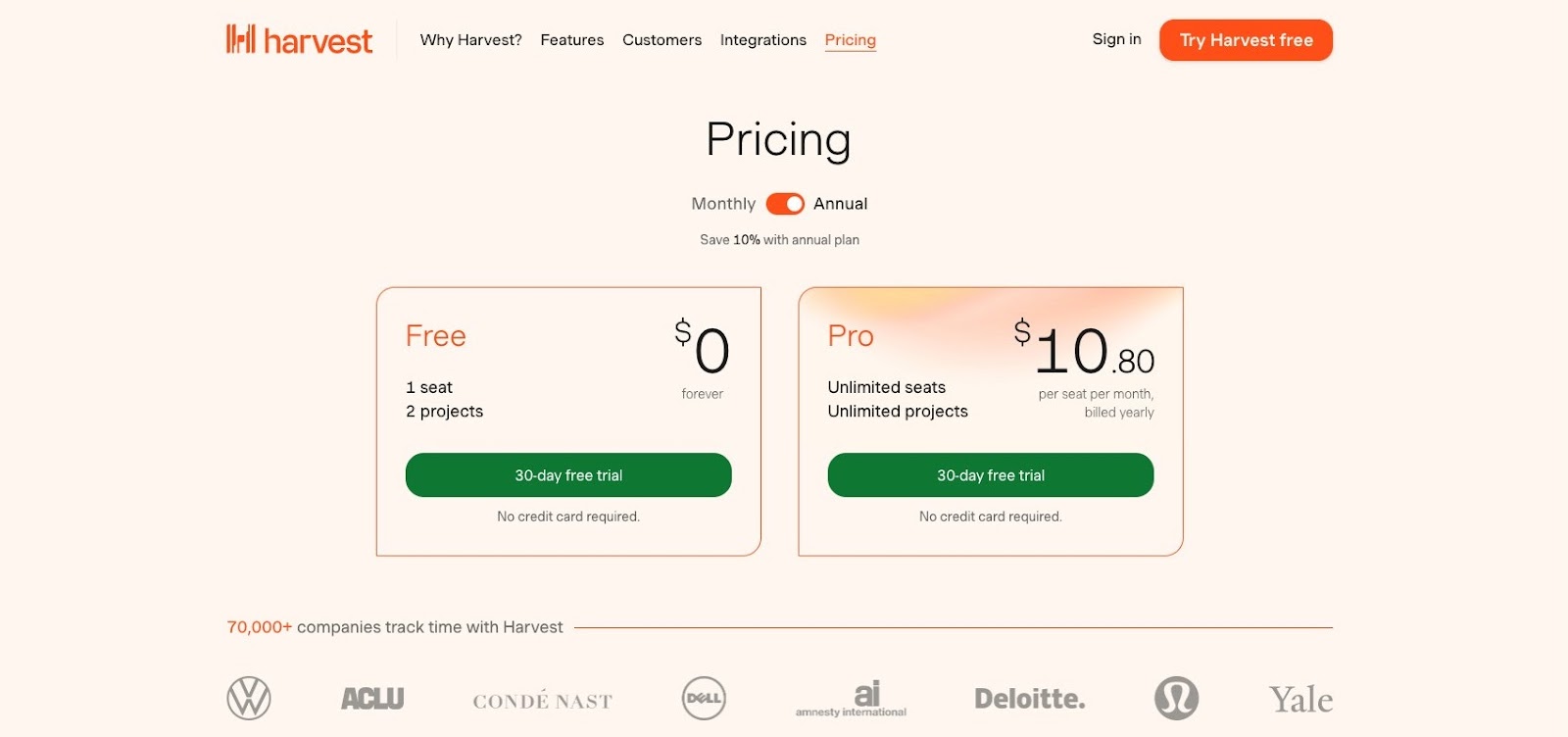
Harvest has two direct offers for their time tracking software: Free and Pro. The Pro plan is highlighted with a subtle gradient drawing the eye to the plan and its price.
Even though both CTA buttons offer a free trial, it’s challenging to focus on something other than the Pro offer because of its unique color treatment.
6. Play with size to highlight popularity and value
Want to show buyers which product is more important as they compare? Go big with your offer. It prioritizes its significance to buyers and points them to where they should look.
Using size to separate tiered pricing allows you to add more information about the benefits of using your product or service.
Basecamp
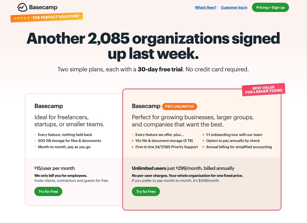
Basecamp uses size to bring people’s attention—especially those in larger organizations—to their more expensive plan. But where it truly shines is how they approach their messaging for two different audiences with vastly different business requirements.
The company visually signals that the plan they prefer people to buy is literally a big deal.
Elegant Themes

The relaxing color palette and soft shapes used on Elegant Theme’s site don’t prepare you for the sudden size difference once you get to their two pricing tiers. Both plans use distinctive colors so page visitors can immediately compare the two.
However, there’s a dramatic optical push-pull happening.
The Lifetime Access plan is much larger than the cheaper option. But the Yearly Access option is pushed back, showing customers it’s not the best deal compared to the jumbo option.
In this case, the design of this pricing page is quick to show buyers which choice Elegant Themes wants them to go with.
Strattic

Site building and hosting platform, Strattic combines both color and size to differentiate between each of their plans.
Adding a bar above the professional plan sets it apart from the Starter and Business tiers, indicating its popularity to potential customers.
This small graphic element gives the Professional tier more height and visually places it above the surrounding ones.
Design your pricing pages to get the sale
A high-converting pricing page gives new and upgrading customers a quick snapshot of your different products. It’s a prime opportunity to visually direct people toward your most attractive offer.
Understanding the behavior behind how people read and interpret design elements makes it easier to visually optimize your tiers on a page with some of the highest tension for buyers.
These pages have to take the guesswork out of determining which product fits your customer’s needs. Instead, your pricing pages must give them the right visual indicators to make a decision confidently.