Why Ecommerce Visitors Bounce From Sites (and How to Stop It)
You don’t need to understand what makes people stay on your B2B ecommerce site or why they leave if you have a lot of traffic coming through. Eventually, you’ll turn a few of those visitors into buyers. It’s a waste of time and resources to parse out the problems leading to high exit rates and optimize your copy to convert more visitors.
Or is it?
The people visiting your site aren’t wearing nametags revealing their deepest thoughts and biggest hangups related to your products. But by analyzing their behavior once they make it to your site, you can see what contributed to its high bounce rate and the barriers stopping people from converting.
And it begins by knowing three types of B2B ecommerce visitors and understanding what makes them bounce.
Who are hard, medium, and soft bouncers?
On average, smaller ecommerce sites have a bounce rate three times higher than larger ones. And if you’re one of the smaller businesses in the game, then you’re paying attention to the numbers.
You may have looked at them recently and saw that your exit rate tracks higher than you prefer. Something needs to change. But what?
Before making drastic changes to your website or landing pages, let’s look at three types of visitors (human, not bots) dropping in and leaving websites: hard, medium, and soft.
Hard bouncers – Tough nuts to crack
These people came to your site briefly, didn’t immediately find what they were looking for, and left. It could be that they got to your home or landing page after clicking on an ad. Once they arrived, there was a disconnect between the ad’s copy and what they found on the corresponding ecommerce store page.
Or, they landed on your site by accident and immediately popped out again. The average time these people spent on the page was only milliseconds. They didn’t stick around to click on any links or read about your products. Because of this, hard bouncers are the hardest to reengage. This category of visitor either never intended to visit your site, or your offer didn’t match what they needed.
Medium bouncers – Showed a little more interest, but not enough
For this group, they spent a little more time engaging with your ecommerce site. They hung out for a few seconds, scrolling and scanning through the page. Perhaps something relevant caught their eye, and they skimmed a bit more. But whatever they saw either didn’t give them what they wanted, bored or spooked them.
Soft bouncers – Easiest to reengage
Soft bouncers stayed on the site for longer than medium and hard bouncers. Maybe they even clicked through to another product page or added something to their cart. For whatever reason, though, they had second thoughts and left without completing any action.
This group is the easiest to reengage once they’ve moved away from a page. Abandoned cart reminder emails, retargeting ads, or other personalized messaging are all tactics that, when done well, can turn bouncers into a returning visitor.
Out of the three types of site bouncers mentioned here, it makes the most sense to focus on the lowest-hanging fruit. Medium and soft bouncers showed an initial interest in your site and its products. Now you have to figure out whether these visitors left because they weren’t your ideal buyer, didn’t have the time to learn about your products, or if it was something else entirely.
Common reasons why ecommerce visitors bounce
Overall, the average bounce rate for ecommerce sites hovers around 47% across multiple industries. And for B2B sites, the struggle to engage site visitors is real. As more B2B organizations expand their ecommerce capabilities, a Sana report revealed that 50% of these sites aren’t meeting buyer expectations. This disappointment, of course, leads to a lower conversion rate.
When digging further into what’s turning visitors off, look at the most common issues plaguing sites.
Unnecessary hurdles
People don’t want to wait for slow load times or five carousels to cycle through in the hero image. Most site visitors don’t have the patience to figure out which elements they should click on or whether they need to scroll further if they aren’t clearly defined.
And they will not hesitate to click the Back button.
For professional hospitality/catering uniform supplier Le Nouveau Chef, the site’s minimalistic design makes their call-to-action (CTA) text buttons very small and hard to see automatically. But worse, the site’s hero image doesn’t immediately tell users to scroll down to see additional product categories, care instructions, or product lines.
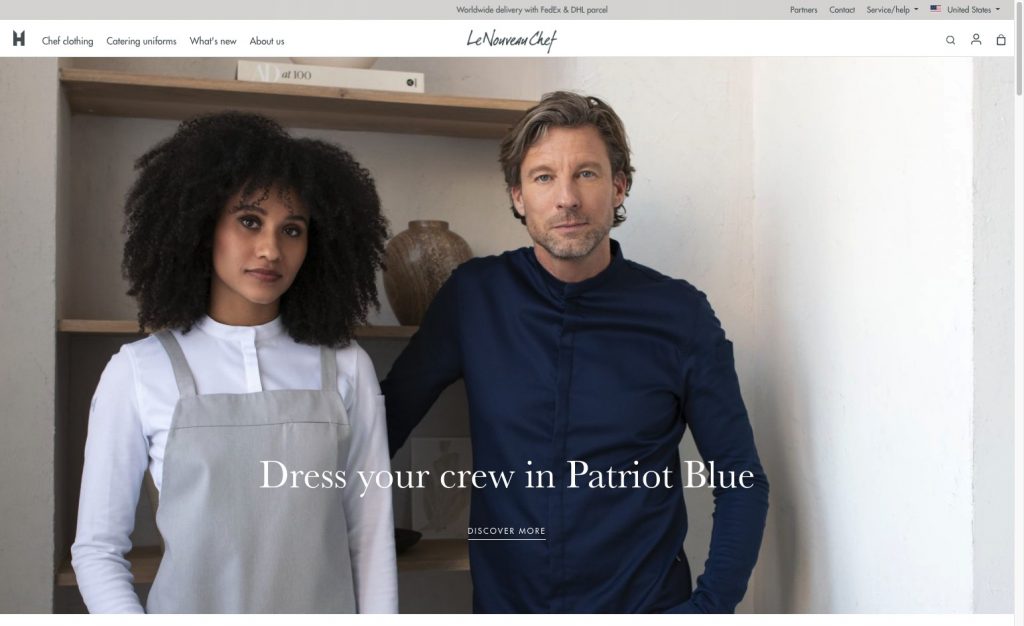
In The Fold Manifesto: Why the Page Fold Still Matters, the report points out that these additional hurdles “adds an extra step that users must take to accomplish their goal.” When there are too many things to do or think through, they’re less likely to do anything. Instead, they get frustrated and leave, leading to a higher bounce rate.
Poor site design or architecture
Dated site designs plus a non-existent mobile-friendly interface are a combination that increases the odds of your bounce rate climbing. Not following design principles and user experience dissuades potential buyers from taking the site—and your business—seriously.
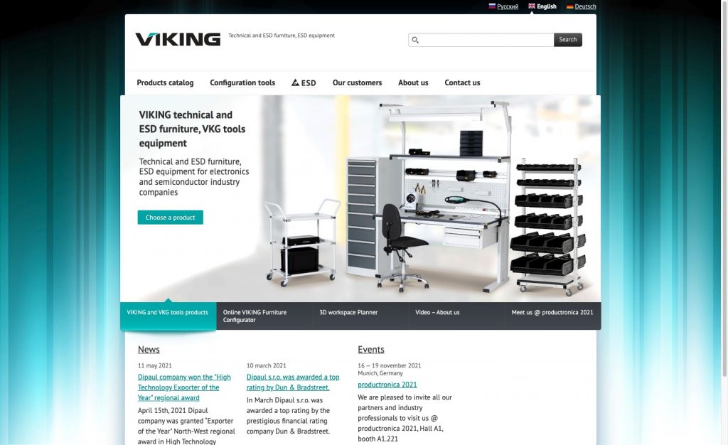
Technical and electrostatic equipment company, VIKING‘s website, leaves much to be desired with an outdated, non-mobile-friendly design and unintuitive navigation. The add-to-cart functionality and CTAs are buried deep within the site’s product pages. This is an example of making site visitors work harder to determine the next step. It’s also one of the major user experience issues leading to cart abandonment.
People want to access information online as quickly as possible.
In a series of studies spanning over 13 years, researchers found that most people don’t take the time to read through pages. They skim. Visitors who can’t find what they’re looking for get frustrated. It’s even worse, though, if they’ve found what they need but cannot quickly move on to the next step to check out or sign up.
Confusing or conflicting information
One Gartner study discovered that half of B2B buyers thought the information they saw on supplier sites was trustworthy. At the same time, they often found contradictions in what they heard from sales representatives, which was different from the site’s product descriptions, delivery information, and inventory counts.
Naturally, this leads to buyers feeling less confident, decreasing their chances of buying by up to 160%, according to Gartner’s study. This explains why some soft bouncers would stay on a site only to suddenly leave as they move closer to the cart.
Tools to understand ecommerce site bouncers
Optimizing your B2B website or landing page so people stay and convert means empathizing with your visitors and seeing the site through their eyes. Because as much work as you and your team put into the site, if you’re experiencing high-exit rates, there’s room for improvement.
And to do this, data analysis is critical.
For instance, Google Analytics shows changes in the total number of site visitors over time, website bounce rate, and other on-page interactions. But it’s not the best tool to analyze a person’s behavior once they’ve landed on the page. For that, you can look for patterns that highlight which elements to optimize using one or, hopefully, a combination of the methods below and conventional analytics.
Using heatmaps to understand visitor behavior
Heatmaps reveal what people pay attention to on a page in real-time, showing you what buttons or links they clicked, how far they scrolled, and more. Instead of guessing where visitors focus their attention, this tool lets you see it directly through color.
As a word of caution, heatmaps provide the most useful information when:
- There is a significant amount of traffic coming to your site. (new sites won’t have enough traffic for accurate data)
- You’ve picked out specific pages you want to test versus the entire site. (prevents an influx of skewed, useless data and wasted resources)
- Pages are consistently monitored to identify changes in visitor behavior (so you can continue to optimize based on current data)
And while heatmaps show you what people interact with, it also shows what they expect to find on the site. Heatmaps reveal places on a page where visitors thought a link or button would exist. They also uncover which parts of the checkout process stopped potential customers in their tracks before they left.
Using surveys to understand visitors in their own words
Want to know what people were looking for on your site but couldn’t find? Ask them directly. Feedback forms and exit surveys reveal the conversations going on in people’s minds as they enter or leave your site.
But to get this information, you have to come up with the right questions. The responses you get can help you identify friction points and create opportunities to deliver a better user experience in the future.
Types of surveys
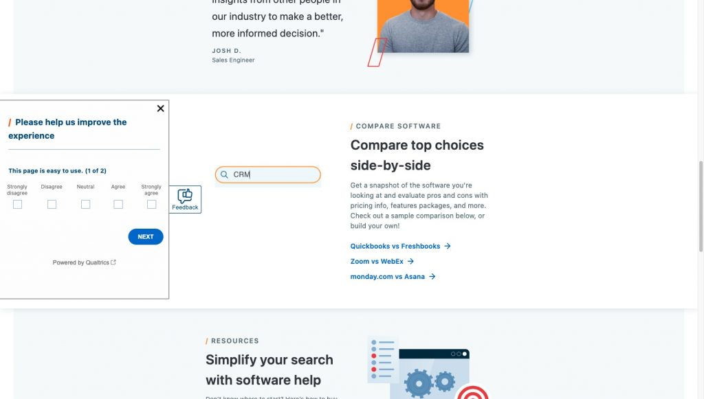
Widget survey
Widget surveys appear as a small component in the corner of a web page. Once it’s clicked on, the widget opens up as a form. These site elements are unobtrusive and give website visitors the freedom to initiate a survey from their end to provide feedback whenever they want without disrupting the on-site experience.
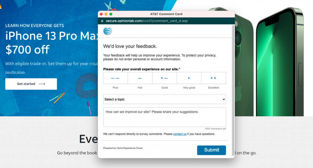
Pop-up survey
Pop-ups appear as soon as an action is triggered. They can vary in intrusiveness, from appearing right smack in the middle of the page as the visitor scrolls or taking up space in the corner of the site. When deciding where to put them on a page, consider where site visitors are in their path to conversion. It may not make sense to trigger the survey as soon as they land on the page. Instead, you might get them as they leave the site or move back and forth between product pages.
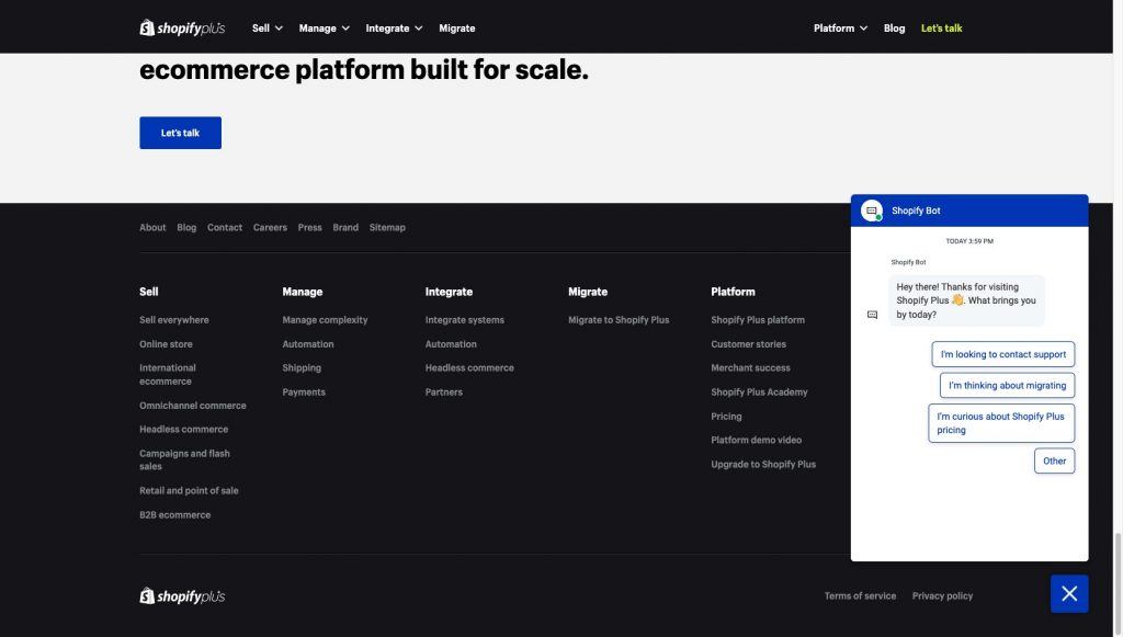
Collapsible pop-up survey
These surveys provide the best of both worlds since they combine pop-up and widget surveys into one. When triggering an event, like landing on or navigating to another page, the survey appears similarly like its pop-up cousin.
Instead of disappearing when closing it, the survey minimizes and relegates itself to the corner or side of the page. Visitors can open it again at any time and fill out the form at their convenience.
The data gathered from these surveys can yield insights that you may not have even considered but ultimately gives you more tools to keep people on the page and potentially reengage those medium and soft bouncers.
Updating your ecommerce website based on insights
When you begin optimizing your site, you need to use the lessons learned through data analysis and site audits to keep the momentum going, especially since the bar to conversions on B2B ecommerce sites is so high.
And as more B2B buyers buy products online, they expect a digital experience that mimics what B2C retailers, travel, and media companies provide. For B2B ecommerce sites, this means reducing any friction that:
- Creates uncertainty by not matching the website’s messaging, visuals, and product offerings to the visitor’s expectations.
- Interferes with giving people enough information to make a decision
- Provides too many choices that cause decision fatigue or paralysis
Instead, optimize based on your—and your ideal buyer’s—goals to decrease the likelihood of them leaving as soon as they land on your site.
Optimizing CTAs
From start to finish, all of your site’s copy, from headlines to legal disclaimers, work together to move people towards the CTA. Visitors must see the value in your offer. This means using clear, concise copy that speaks to their needs on every landing and product page.
As they move closer to the CTA, all of the copy surrounding it has to persuade them to take the next step.
And the next. Until they reach the point of conversion.
Optimizing product pages
Product pages often get overlooked as nothing more than a place to showcase merchandise. But high-quality images, persuasive copy, and informative specifications or technical information are critical to determining whether people add items to their cart or abandon the page altogether.
Optimizing these pages starts by not hiding key details in descriptions, using all the visual tools at your disposal, and incorporating copy that speaks directly to the buyer.
Optimizing page designs
Simplicity is key with page layout design. You want to eliminate any elements that distract people or throw them off as they move through the page. This includes removing competing CTAs that interrupt readability.
For B2B eCommerce sites, each step needs to be clearly identified for the visitor. They should know that if they scroll, there’s more information below. Links and buttons must be large enough to see and stand out against the rest of the page.
And text needs to maintain consistency regarding font choices and sizes.
Recovering medium and soft bouncers
The people who land on your site or online store, read the first sentence of the hero, and immediately leave aren’t your ideal customer. But those who spend a little more time on the site before clicking away, those medium and soft bouncers, are the people who almost found what they needed.
Now to improve your bounce rate, you have to determine what they were looking for that you didn’t give them. As humanity generates well over 2.5 quintillion bytes of data per day, you have access to more data than ever before to optimize your B2B ecommerce website.
But it starts by finding the point where a potential customer decided not to keep going. Only then can you pick them back up as returning visitors and turn them into buyers.


